Introduction to Color Psychology
Colors may affect how you feel in a room; they are not just for appearance. The correct paint color can help your place seem just right, from a peaceful blue bedroom to an exciting red dining room. Colors have great power, especially at Style Spaces in Dholahity, Lalitpur, Nepal. Our designers assist customers in selecting colors that enhance mood and vitality, transforming businesses and homes into pleasant and personal spaces.
This paper investigates Color psychology and how various colors impact energy and emotions. We’ll discuss which colors fit best in multiple spaces, provide advice on preventing errors, and showcase 2025 trends, including local favorites from Nepal. You will understand in the end why working with experts like Style Spaces can make all the difference.
Colors and Their Impact
Let’s explore color schemes now. Great for social events, warm hues like red and orange inspire vitality and energy. Calm, ideal colors for bathrooms or bedrooms are blue and green. Colors also have cultural connotations in Nepal; yellow stands for education and study, while crimson symbolizes purity and is often used in weddings.
Individual Color Effects
-
Red: Red is perfect for living rooms or dining areas; it radiates vitality, passion, and enthusiasm. Still, too much usage may lead to stress, which is why it’s ideal as an accent. Red in Nepali tradition stands for wealth and cleanliness.
-
Blue: Perfect for baths and bedrooms for leisure, blue is known for peace and confidence. While deeper blues offer refinement and boost workplace productivity, lighter blues make areas seem spacious.
-
Yellow: Yellow is perfect for kitchens as it brings warmth and cheerfulness and stimulates hunger. Though brighter yellows might be strong, gentler tones like buttery yellows are advised for a balanced impact.
-
Green: Reflects development and nature, adaptable for any space, thus encouraging serenity and leisure. Darker hues ground you; light greens are soothing.
-
Purple: Associated with luxury and innovation, it accentuates elegance fit for a romantic or calm atmosphere in bedrooms. While richer purses offer drama, lighter colors like lavender are calming.
-
Orange: This color is great for playrooms or offices, but it is best used sparingly because of its intensity; it stimulates energy and creativity.
-
Neutrals (White, Black, Gray): White, black, and gray neutrals provide a flexible foundation. White represents purity, so places seem bigger, but if overdone, they might seem sterile. Black adds refinement, used sparingly for contrast. Gray provides harmony, contemporary, and complementary with various hues.
Practical Tips and Trends
Selecting Colors in Line with Room Purpose
-
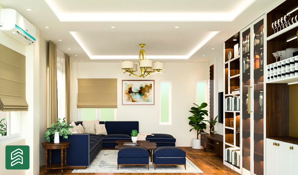
Living Room: Living rooms should be pleasant with warm hues like beige, gentle yellows, or light green. Modern styles call for grays with splashes of color.
-
Bedroom: Cool hues like blues, greens, and lavenders help one relax; harsh reds or oranges should be avoided in the bedroom.
-
Kitchen: Whites or light blues seem fresh and clean; yellows, oranges, and reds boost hunger
-
Bathroom: Whites, light blues, and greens seem fresh and clean; dark colors should not be used in tiny areas. Bathrooms
-
Office: Blues and greens improve concentration; neutrals with accents maximize output. Selecting Colors in Line with Room Purpose
Color Trends for 2025
Earthy colors like clay, olive green, and warm browns are in style worldwide for 2025. People also like bright colors like deep blues and reds. Nepal’s popular colors are green, maroon, and gold, which show off the country’s history and make things more lively.
How to Do It Right in Real Life
-
Check out how colors look at different times of the day by putting them under different lights.
-
Light colors make small rooms look more prominent, and warm colors make dark rooms feel cozier.
-
Light colors make small rooms look more prominent, and warm colors make dark rooms feel cozier.
-
Make sure that the colors move from one room to the next for regularity.
The Role of Professional Guidance
Because color choices are so complicated, it’s beneficial to get help from a professional. Style Slaces is a company in Dholahity, Lalitpur, Nepal, that uses color psychology to create places that make people feel better.
Contact Style Spaces
Are you ready to change the look of your room with the right colors? You can email Style Spaces at [email protected] or call us at +977 986-1135311. In Dholahity, Lalitpur, Nepal, let’s make your home or office a place that makes you feel good and gives you hope.
Summary Table: Colors, Their Effects, and Best Uses
| Color | Psychological Effect | Best Rooms | Cultural Note (Nepal) |
|---|---|---|---|
| Red | Energy, passion | Living room, dining area | Purity, prosperity |
| Blue | Calm, trust | Bedroom, bathroom, office | Divinity, sky connection |
| Yellow | Happiness, warmth | Kitchen, dining area | Knowledge, learning |
| Green | Nature, growth | Any room | Fertility, biodiversity |
| Purple | Luxury, creativity | Bedroom, study | – |
| Orange | Enthusiasm, creativity | Playroom, studio | – |
| White | Purity, simplicity | Any room, small spaces | – |
| Black | Sophistication, power | Accents, modern spaces | – |
| Gray | Neutrality, balance | Modern, versatile spaces | – |